Opinion
-
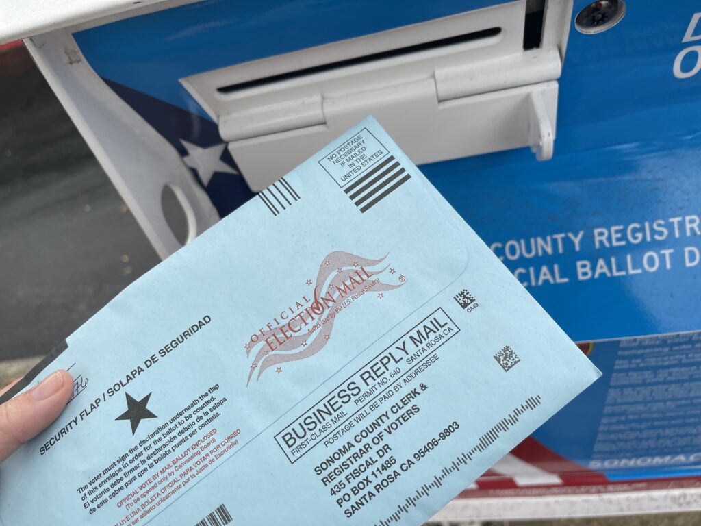
New Poll: Nearly Three in 10 Voters Say They Would Vote Illegally in 2024 Election
Opinion -The best course of action to achieve robust election integrity is for state lawmakers to impose sound election rules that prevent the possibility of illegal voting from occurring in the first place. -

Innovating for a Water-starved Planet
Opinion -Perhaps instead of spending countless trillion of dollars trying to replace fossil fuels with wind, solar and battery technologies, we should focus on adapting to whatever climates we live in or encounter -- especially since China is building hundreds of coal-fired power plants to manufacture wind turbines, solar panels, EVs, grid-scale batteries and transformers to sell to Western nations for that “energy transition.” -
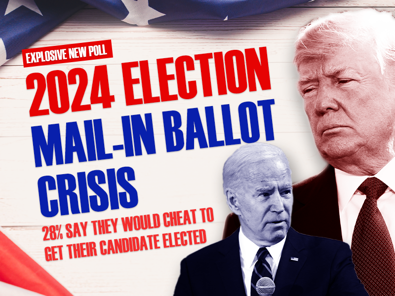
Heartland Institute Poll Shows Nearly Three in 10 Voters Would Vote Illegally in 2024 Presidential Election
Opinion -Press Release -According to the poll, conducted by Rasmussen, approximately 44 million Americans would vote illegally in 2024 election “to prevent other side from winning.” -

-

California Sets New Rule for Chevron, Gas Price Is Expected to Rise
Opinion -In a recent interview, energy expert Ronald Stein discussed California’s shifting energy landscape and the challenges of transitioning away from fossil fuels. -

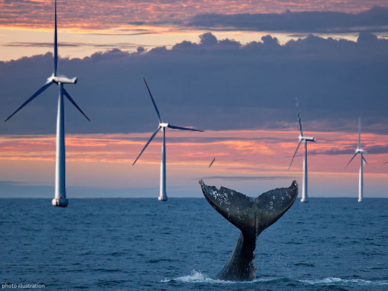
Off Shore Wind Farms Are Detrimental to Whales
Opinion -Although correlation does not automatically lead to causation, in this particular instance, it sure seems likely that there is a connection between the rapid rise in whale deaths and the pre-construction and construction activities of the off shore wind farms along the U.S. East Coast. -
Lack of Consumer Demand for Electric Vehicles Must Be Acknowledged
Opinion -Because the lack of organic consumer demand for EVs is becoming more apparent by the day, the Biden administration is resorting to heavy-handed tactics to “nudge” Americans away from gasoline-powered cars. -
Biden’s Medicare Advantage Cuts Are Tantamount to Throwing Grandma Over the Cliff
Opinion -Biden didn’t merely propose Medicare Advantage (MA) reforms a dozen years in the future. He cut rates from a projected 2.44 percent to 2.33 percent, despite industry predictions of a 4 to 6 percent growth rate. -
PRESS RELEASE: Whales Die While Dominion Energy Hides Crucial Information
Opinion -Press Release -Federal regulations prohibit even one human-caused death per year if the right whale is to survive as a species. -
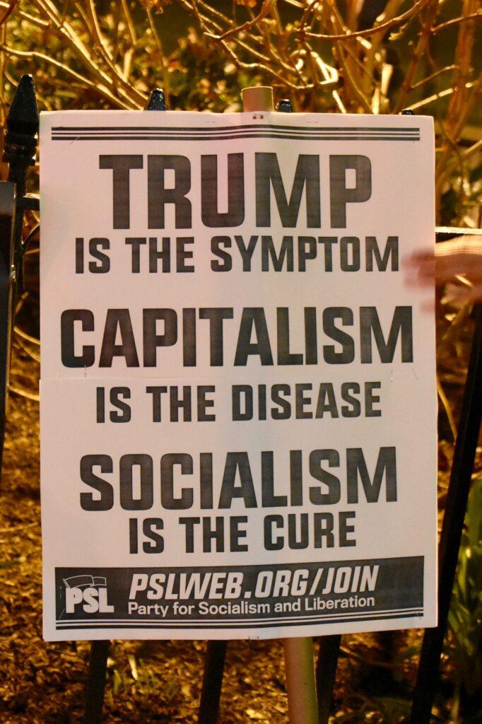
Socialism at a Glance
Opinion -The reason that so many American students have a distorted view of socialism is simple: they have been spoon-fed a sugar-coated version of socialism on social media, in classrooms, and throughout the entertainment universe. -

The Age of Underpopulation Is Here
Opinion -The lesson from the overpopulation debacle is that people adapt to their environment. -

Students Deserve to Know the Truth About Socialism
Opinion -For the past few decades, American students have been taught a whitewashed version of socialism. -

PRESS RELEASE: The Heartland Institute Releases New Book: Socialism At A Glance
Opinion -Press Release -Book includes brief history of socialism, breakdown of socialist ideology, several national case studies, and examination of democratic socialism in the United States. -

Heartland’s ‘Climate at a Glance’ is the antidote to Earth Hour
Opinion -So, go to the Google Play Store or Apple App Store and quickly download the “Climate at a Glance” app to your cell phone. -

From ‘The Great Reset’ to ‘The Great Taking’
Opinion -The Great Taking refers to a decades-long plan by a cast of characters hellbent on ensuring that the entire economic game is rigged so much in their favor that they win under practically any and all circumstances. -

As Federal Government Collapses, States Offer Solutions
Opinion -Under the doctrines of unbridled federal and judicial supremacy, the U.S. government has taken on so much power that it can no longer perform its basic functions, let alone do all that it has promised. -

Cyberattacks Against Health Care Industry Are Cause for Concern
Opinion -Cyberattacks like the one perpetuated against UHG are alarming because they could potentially destabilize the entire U.S. health care industry. -

Crying Crocodile Tears Over ‘Sue-and-Settle’
Opinion -Letting outside groups sue the government to compel enforcement actions dates from the Nixon years, and during the Reagan era became a favorite tactic of the environmental industry. -

Gold Hill School: A Symbol of Freedom in Colorado
Opinion -When schools, such as the Gold Hill school, deliver quality education at a reasonable cost, citizens support them. -

Renewables Will Return America’s Lifestyle Back to the Pre-1800’s – This Is the Biden Energy Plan.
Opinion -Germany, the first country to go “green” with an electricity generation transition to renewables, now has electricity rates that are among the highest in the world, and threatens to be an unaffordable, unrealizable disaster, according to the government's own independent auditors. -

Unexpected Economic Growth in 2023
Opinion -Government spending, hiring, and mandates reduce the connection between GDP and satisfaction. Economic growth in 2023 surprised many economists, but 2.5 percent probably overstates the growth in prosperity. -
Biden’s War on Mobility
Opinion -Although Biden and his cadre of climate alarmists seem giddy about the prospect of making the gasoline-powered vehicle a thing of the past for hard-working Americans, they would be wise to second-guess that decision. -

Big Tech Censorship and the Supreme Court
Opinion -Like it or not, Ketanji Brown Jackson has absolutely no business being on the U.S. Supreme Court, the highest court in the land, in which major societal decisions with far-reaching consequences are routinely made. -
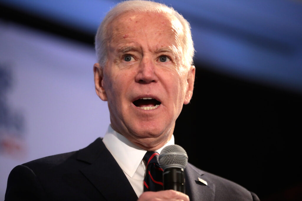
Biden’s New Rule on Auto Emissions Will Accelerate Death Spiral for Auto Manufacturers
Opinion -By re-enforcing the mandates to EV’s, Biden is forcing automobile manufacturers into a death spiral, as most of the 8 billion on this planet will never be able to afford an EV !